devtools::install_github("wilkelab/ungeviz")
pacman::p_load(ggdist, ggridges, ggthemes, colorspace, tidyverse, ggstatsplot, rstantools, readxl, performance, parameters, see, ungeviz, plotly, crosstalk, DT, gganimate, FunnelPlotR, knitr)Hands-on Exercise 4
Getting Started
Installing Packages
For this exercise, the following R packages will be used:
tidyverse, a family of R packages for data science process.
ggridges, a ggplot2 extension specially designed for plotting ridgeline plots.
ggdist for visualising distribution and uncertainty.
ggstatsplot package to create visual graphics with rich statistical information.
performance package to visualise model diagnostics.
parameters package to visualise model parameters.
plotly for creating interactive plot.
gganimate for creating animation plot.
DT for displaying interactive html table.
crosstalk for for implementing cross-widget interactions (currently, linked brushing and filtering).
readr for importing csv into R.
FunnelPlotR for creating funnel plot.
ggplot2 for creating funnel plot manually.
knitr for building static html table.
Data Import
Once again, Exam_data.csv will be utilized for the exercise.
exam <- read_csv("data/Exam_data.csv")Once these steps are completed, the exercise may begin.
Data Visualization
Ridgeline Plot
Ridgeline plots show a dataset’s distribution of numeric values. There are many options as to how these can be visualized.
ggplot(exam,
       aes(x = ENGLISH,
           y = CLASS,
           fill = stat(x))) +
  geom_density_ridges_gradient(
    scale = 3,
    rel_min_height = 0.01) +
  scale_fill_viridis_c(name = "Temp. [F]",
                       option = "C") +
  scale_x_continuous(
    name = "English grades",
    expand = c(0, 0)
  ) +
  scale_y_discrete(name = NULL, expand = expansion(add = c(0.2, 2.6))) +
  theme_ridges()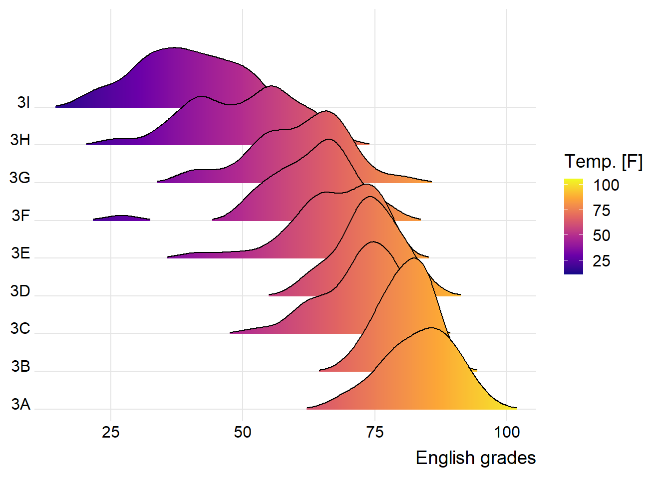
ggplot(exam,
       aes(x = ENGLISH,
           y = CLASS,
           fill = 0.5 - abs(0.5-stat(ecdf)))) +
  stat_density_ridges(geom = "density_ridges_gradient",
                      calc_ecdf = TRUE) +
  scale_fill_viridis_c(name = "Tail probability",
                       direction = -1) +
  theme_ridges()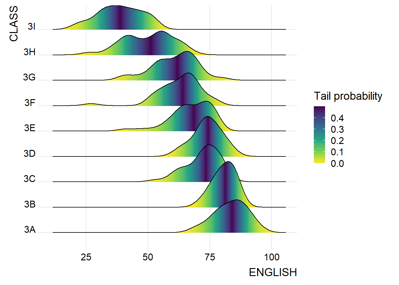
ggplot(exam,
       aes(x = ENGLISH,
           y = CLASS,
           fill = factor(stat(quantile))
           )) +
  stat_density_ridges(
    geom = "density_ridges_gradient",
    calc_ecdf = TRUE,
    quantiles = 4,
    quantile_lines = TRUE) +
  scale_fill_viridis_d(name = "Quartiles") +
  theme_ridges()
ggplot(exam,
       aes(x = ENGLISH,
           y = CLASS,
           fill = factor(stat(quantile))
           )) +
  stat_density_ridges(
    geom = "density_ridges_gradient",
    calc_ecdf = TRUE,
    quantiles = c(0.025, 0.975)
    ) +
  scale_fill_manual(
    name = "Probability",
    values = c("#FF0000A0", "#A0A0A0A0", "#0000FFA0"),
    labels = c("(0, 0.025]", "(0.025, 0.975]", "(0.975, 1]")
  ) +
  theme_ridges()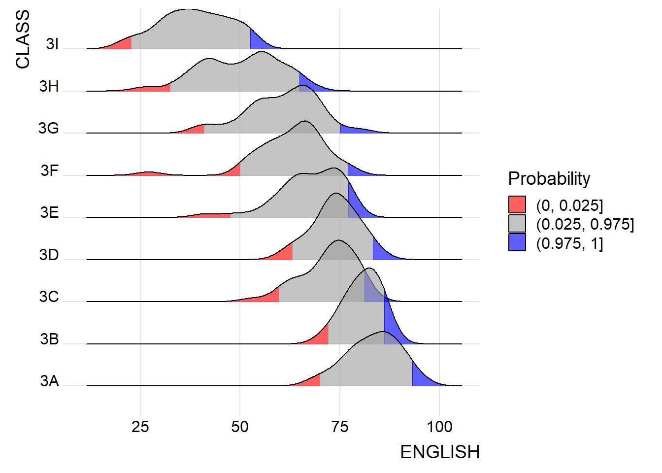
Raincloud Plot
Raincloud is a similar visualization technique to that of the boxplot. However, this method allows viewers to gain a clearer view of the dataset by showing areas where densities are clustered. However, a rancloud may be combined with a boxplot and a half-dotplot in order to show a clearer view of the data.
ggplot(exam,
       aes(x = RACE,
           y = ENGLISH)) +
  stat_halfeye(adjust = 0.5,
               justification = -0.2,
               .width = 0,
               point_colour = NA) +
  coord_flip() +
  theme_economist()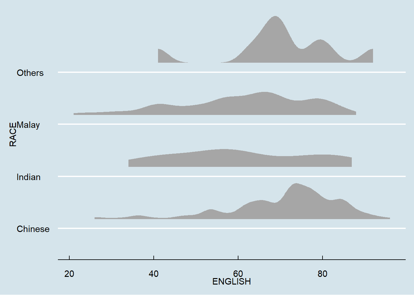
ggplot(exam,
       aes(x = RACE,
           y = ENGLISH)) +
  stat_halfeye(adjust = 0.5,
               justification = -0.2,
               .width = 0,
               point_colour = NA) +
  geom_boxplot(width = .20,
               outlier.shape = NA) +
  stat_dots(side = "left",
            justification = 1.2,
            binwidth = .5,
            dotsize = 1.5) +
  coord_flip() +
  theme_economist()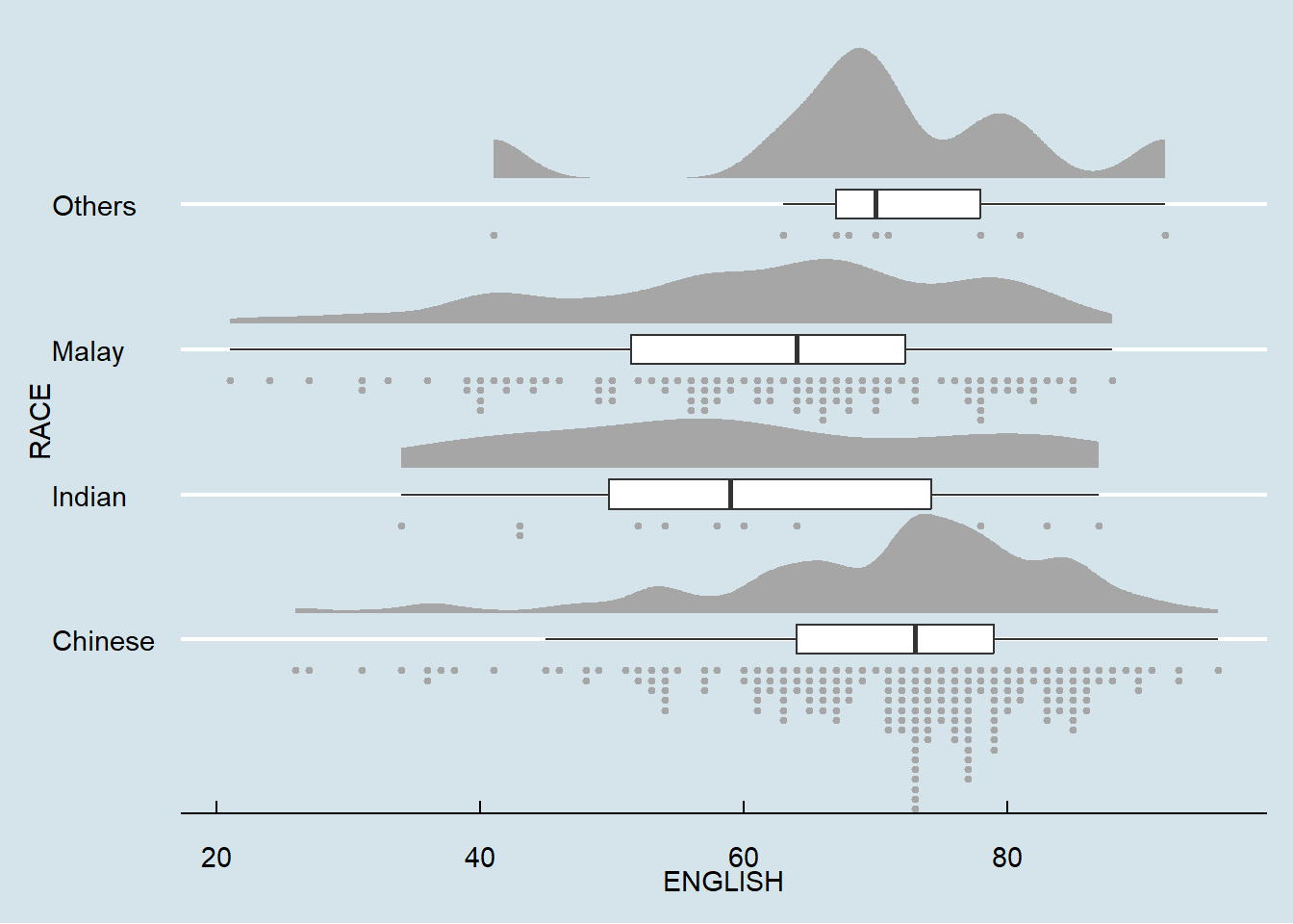
Visual Statistical Analysis
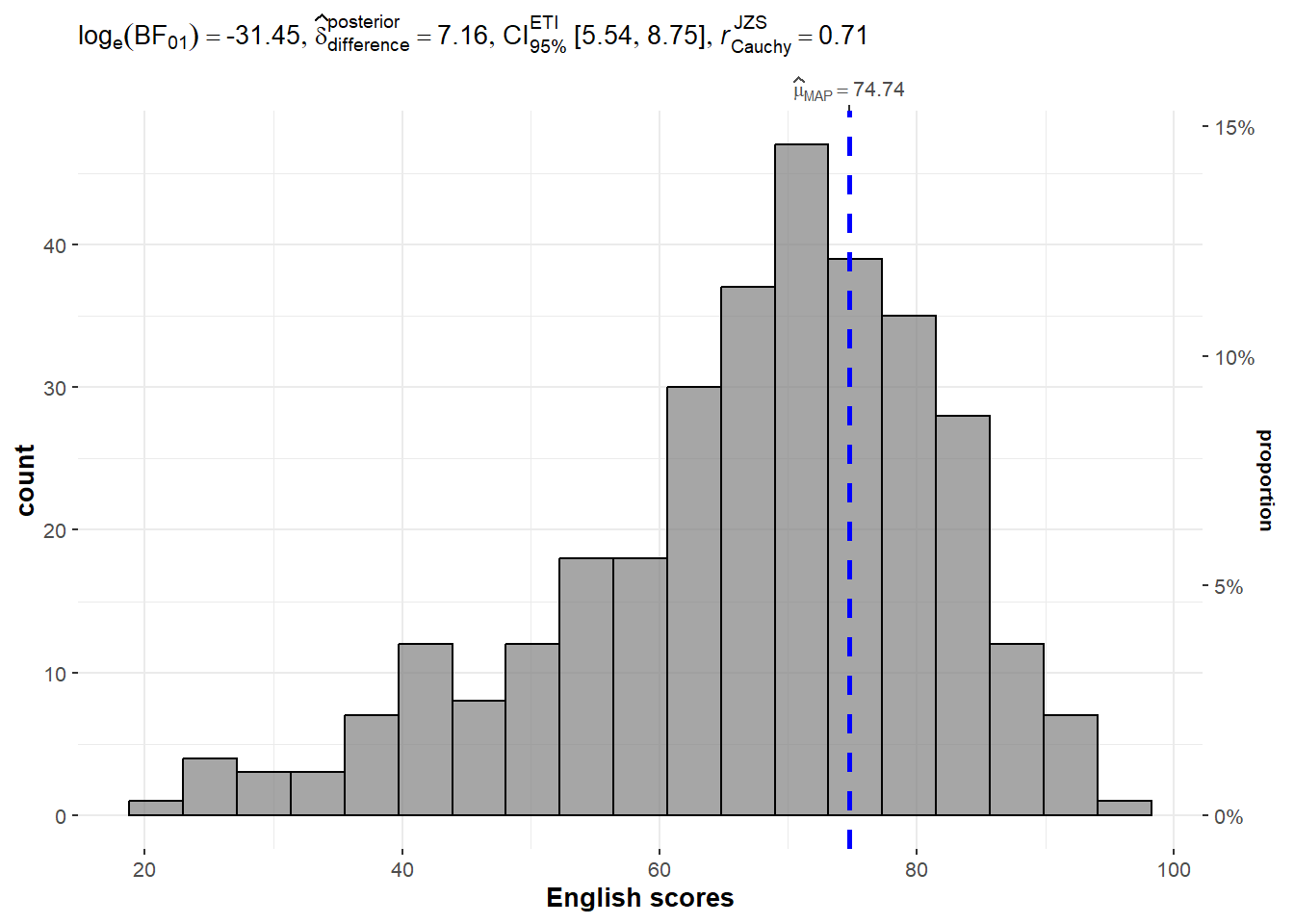
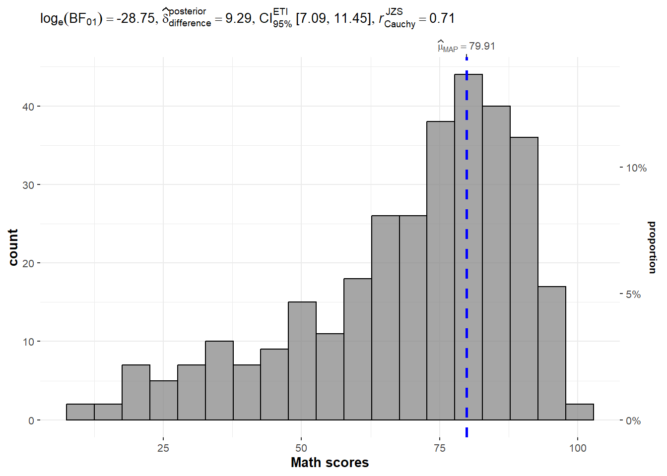
One-sample Test
The code chunk below is used to build a one-sample test on the different test scores
set.seed(1234)

gghistostats(
  data = exam,
  x = ENGLISH,
  type = "bayes",
  test.value = 60,
  xlab = "English scores"
)
set.seed(1234)

gghistostats(
  data = exam,
  x = MATHS,
  type = "bayes",
  test.value = 60,
  xlab = "Math scores"
)
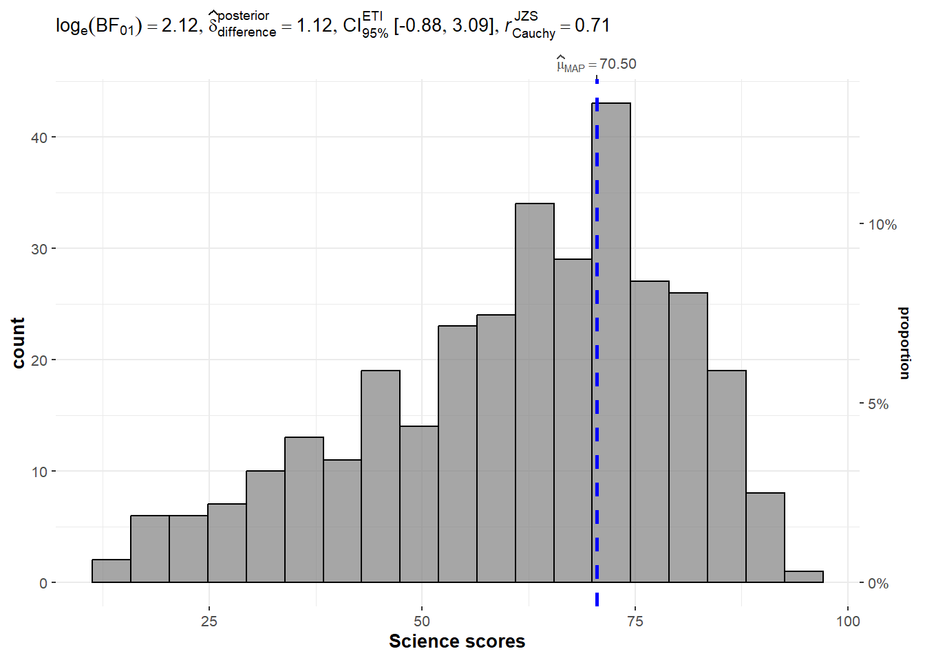
set.seed(1234)

gghistostats(
  data = exam,
  x = SCIENCE,
  type = "bayes",
  test.value = 60,
  xlab = "Science scores"
)
Two-sample Mean Test
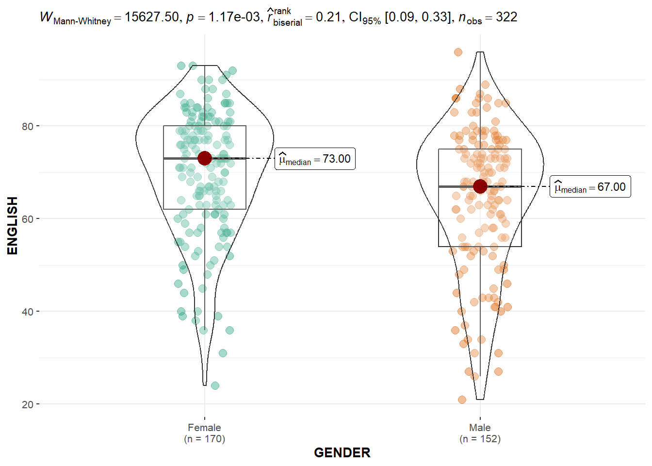
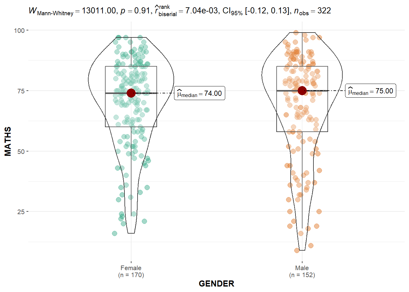
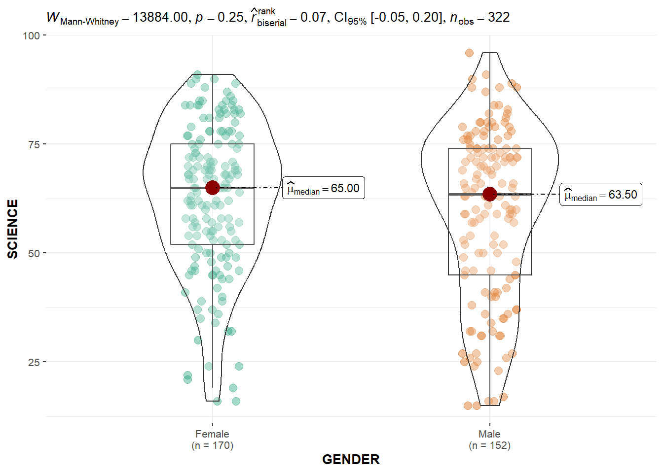
The code chunk below builds a visual two-sample mean test for each subject score by gender.
ggbetweenstats(
  data = exam,
  x = GENDER,
  y = ENGLISH,
  type = "np",
  messages = FALSE
)
ggbetweenstats(
  data = exam,
  x = GENDER,
  y = MATHS,
  type = "np",
  messages = FALSE
)
ggbetweenstats(
  data = exam,
  x = GENDER,
  y = SCIENCE,
  type = "np",
  messages = FALSE
)
One-way ANOVA Test
The code chunk below builds a One-way ANOVA test for the subject scores by race.
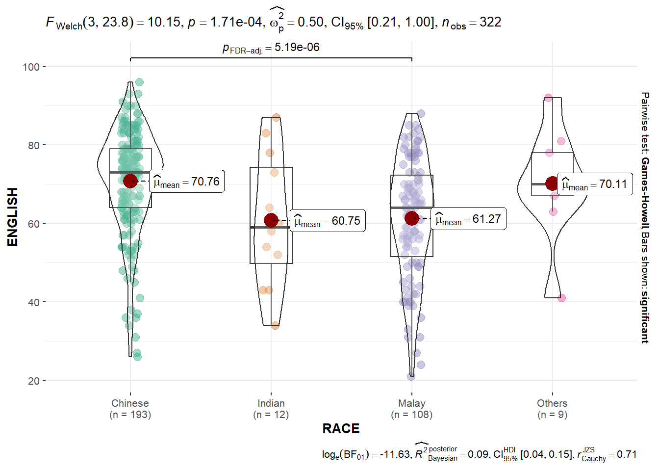
ggbetweenstats(
  data = exam,
  x = RACE,
  y = ENGLISH,
  type = "p",
  mean.ci = TRUE,
  pairwise.comparisons = TRUE,
  pairwise.display = "s",
  p.adjust.method = "fdr",
  messages = FALSE
)
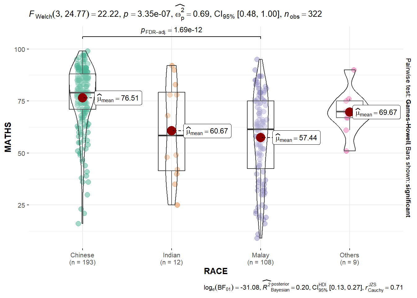
ggbetweenstats(
  data = exam,
  x = RACE,
  y = MATHS,
  type = "p",
  mean.ci = TRUE,
  pairwise.comparisons = TRUE,
  pairwise.display = "s",
  p.adjust.method = "fdr",
  messages = FALSE
)
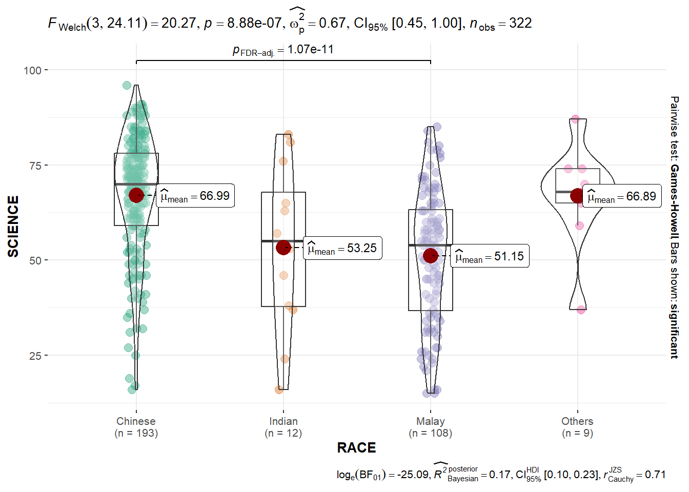
ggbetweenstats(
  data = exam,
  x = RACE,
  y = SCIENCE,
  type = "p",
  mean.ci = TRUE,
  pairwise.comparisons = TRUE,
  pairwise.display = "s",
  p.adjust.method = "fdr",
  messages = FALSE
)
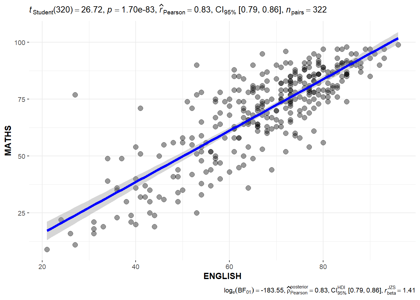
Significant Test of Correlation
The code chunk below can be used to create a Significant Test of Correlation between the scores per subject.
ggscatterstats(
  data = exam,
  x = ENGLISH,
  y = MATHS,
  marginal = FALSE,
  )
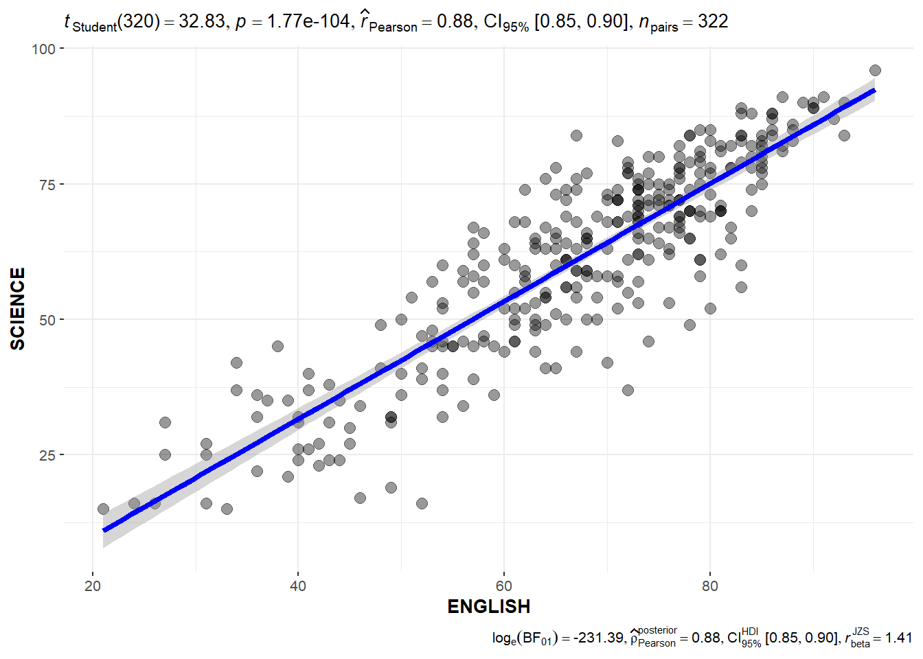
ggscatterstats(
  data = exam,
  x = ENGLISH,
  y = SCIENCE,
  marginal = FALSE,
  )
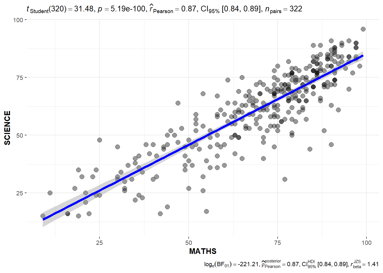
ggscatterstats(
  data = exam,
  x = MATHS,
  y = SCIENCE,
  marginal = FALSE,
  )
Significant Test of Association
The code chunk below bins the Math scores into 4-class variables and then builds a visual for Significant Test of Association
exam1 <- exam %>%
  mutate(MATHS_bins =
           cut(MATHS,
               breaks = c(0,60,75,85,100))
)
ggbarstats(exam1,
           x = MATHS_bins,
           y = GENDER)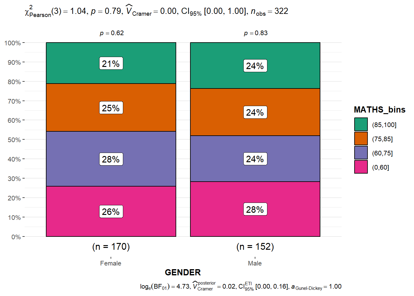
Visualizing Models
For this section, the Toyota Corolla case will be used.The code chunk below imports the data into R.
car_resale <- read_xls("data/ToyotaCorolla.xls",
                       "data")
car_resale
# A tibble: 1,436 × 38
Id Model Price Age_08_04 Mfg_Month Mfg_Year KM Quarterly_Tax Weight
<dbl> <chr> <dbl> <dbl> <dbl> <dbl> <dbl> <dbl> <dbl>
1 81 TOYOTA … 18950 25 8 2002 20019 100 1180
2 1 TOYOTA … 13500 23 10 2002 46986 210 1165
3 2 TOYOTA … 13750 23 10 2002 72937 210 1165
4 3 TOYOTA… 13950 24 9 2002 41711 210 1165
5 4 TOYOTA … 14950 26 7 2002 48000 210 1165
6 5 TOYOTA … 13750 30 3 2002 38500 210 1170
7 6 TOYOTA … 12950 32 1 2002 61000 210 1170
8 7 TOYOTA… 16900 27 6 2002 94612 210 1245
9 8 TOYOTA … 18600 30 3 2002 75889 210 1245
10 44 TOYOTA … 16950 27 6 2002 110404 234 1255
# ℹ 1,426 more rows
# ℹ 29 more variables: Guarantee_Period <dbl>, HP_Bin <chr>, CC_bin <chr>,
# Doors <dbl>, Gears <dbl>, Cylinders <dbl>, Fuel_Type <chr>, Color <chr>,
# Met_Color <dbl>, Automatic <dbl>, Mfr_Guarantee <dbl>,
# BOVAG_Guarantee <dbl>, ABS <dbl>, Airbag_1 <dbl>, Airbag_2 <dbl>,
# Airco <dbl>, Automatic_airco <dbl>, Boardcomputer <dbl>, CD_Player <dbl>,
# Central_Lock <dbl>, Powered_Windows <dbl>, Power_Steering <dbl>, …The following code chunks are used to check various tests on the data.
model <- lm(Price ~ Age_08_04 + Mfg_Year + KM +
              Weight + Guarantee_Period, data = car_resale)
check_c <- check_collinearity(model)
plot(check_c)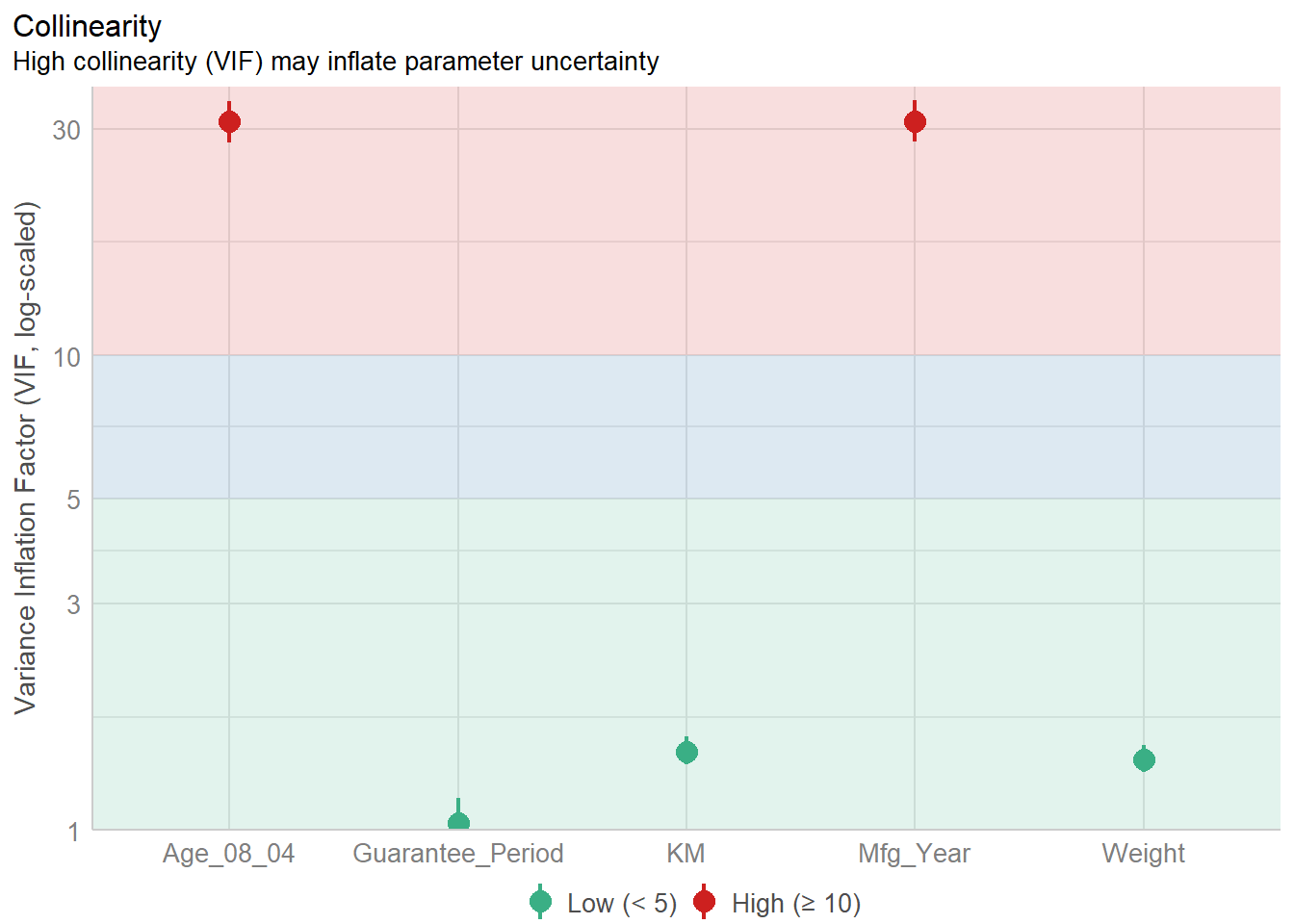
model1 <- lm(Price ~ Age_08_04 + KM +
              Weight + Guarantee_Period, data = car_resale)
check_n <- check_normality(model1)
plot(check_n)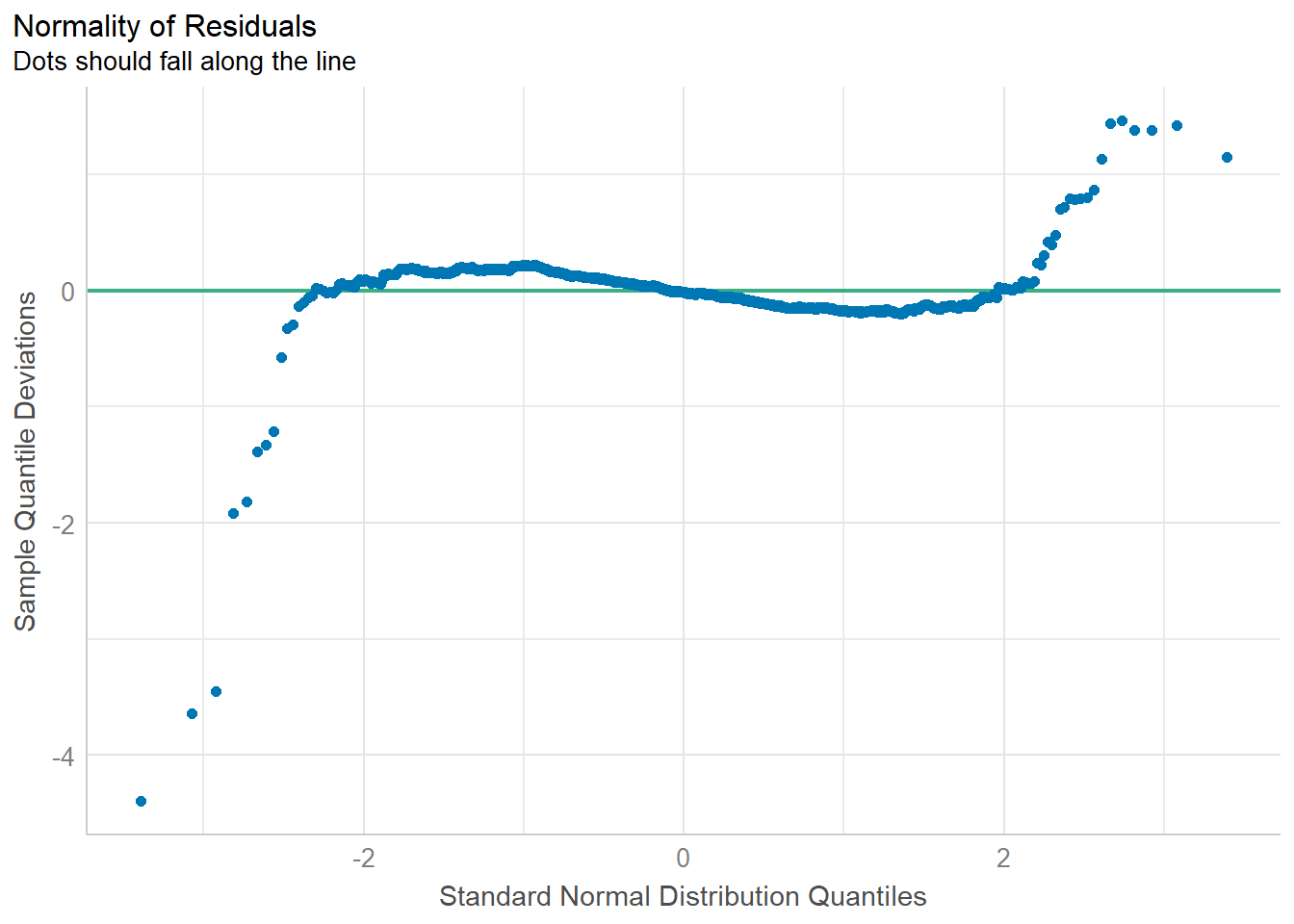
model1 <- lm(Price ~ Age_08_04 + KM +
              Weight + Guarantee_Period, data = car_resale)
check_h <- check_heteroscedasticity(model1)
plot(check_h)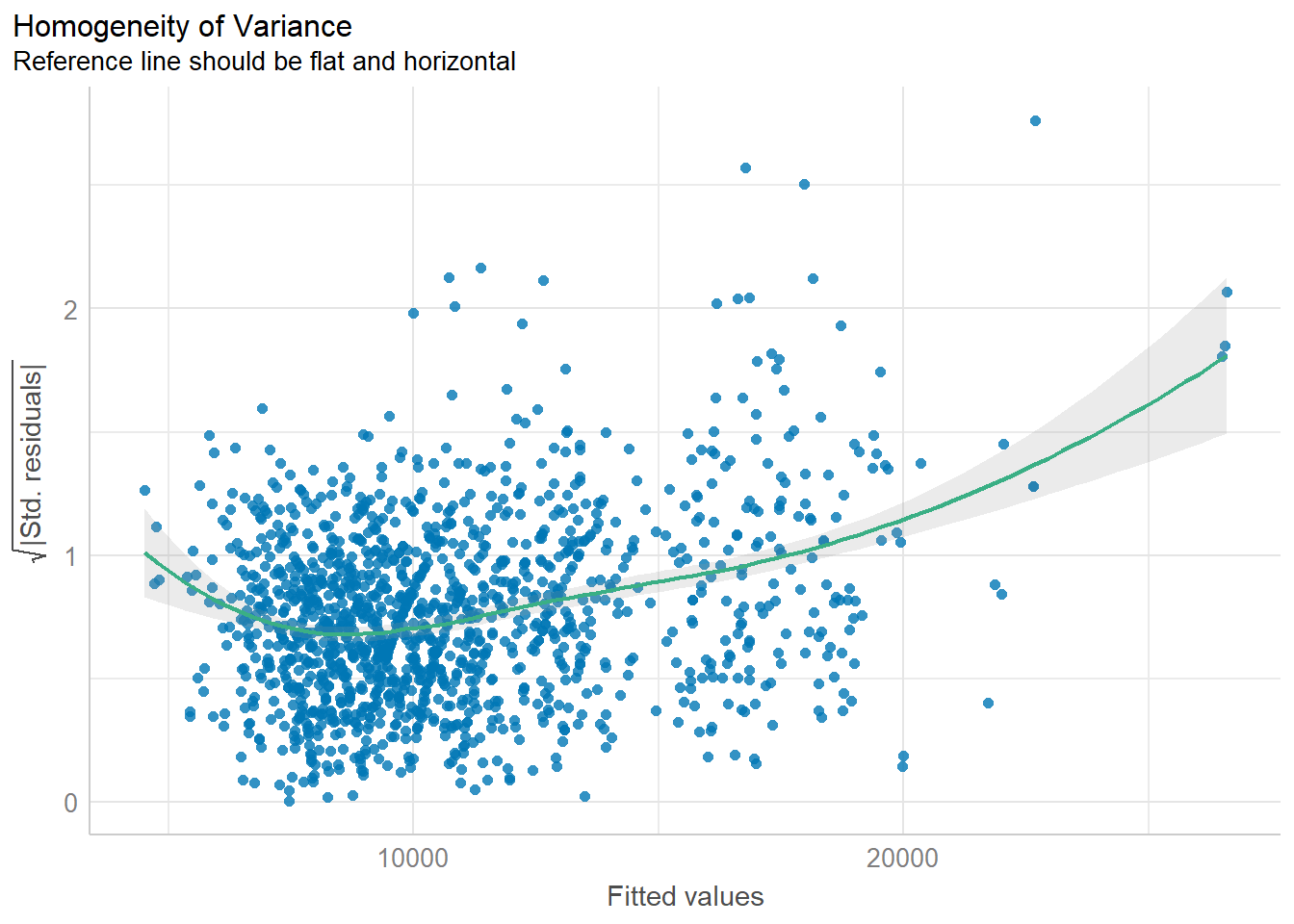
All of these can also be done simultaneously using the code chunk below.
check_model(model1)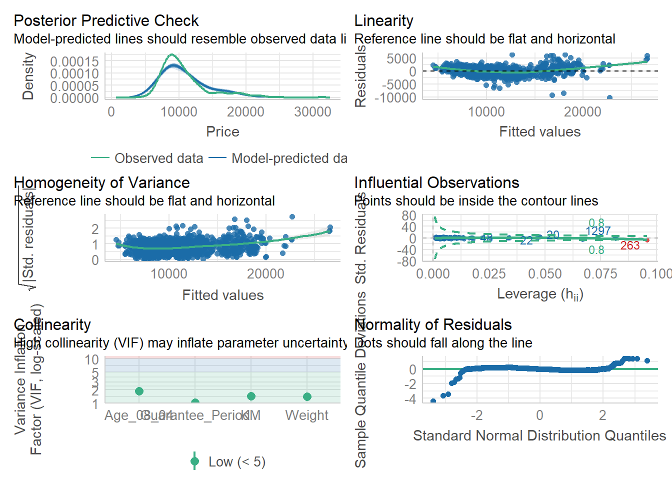
Visualizing Regression Parameters
There are 2 options to visualize the parameters of a regression model.
plot(parameters(model1))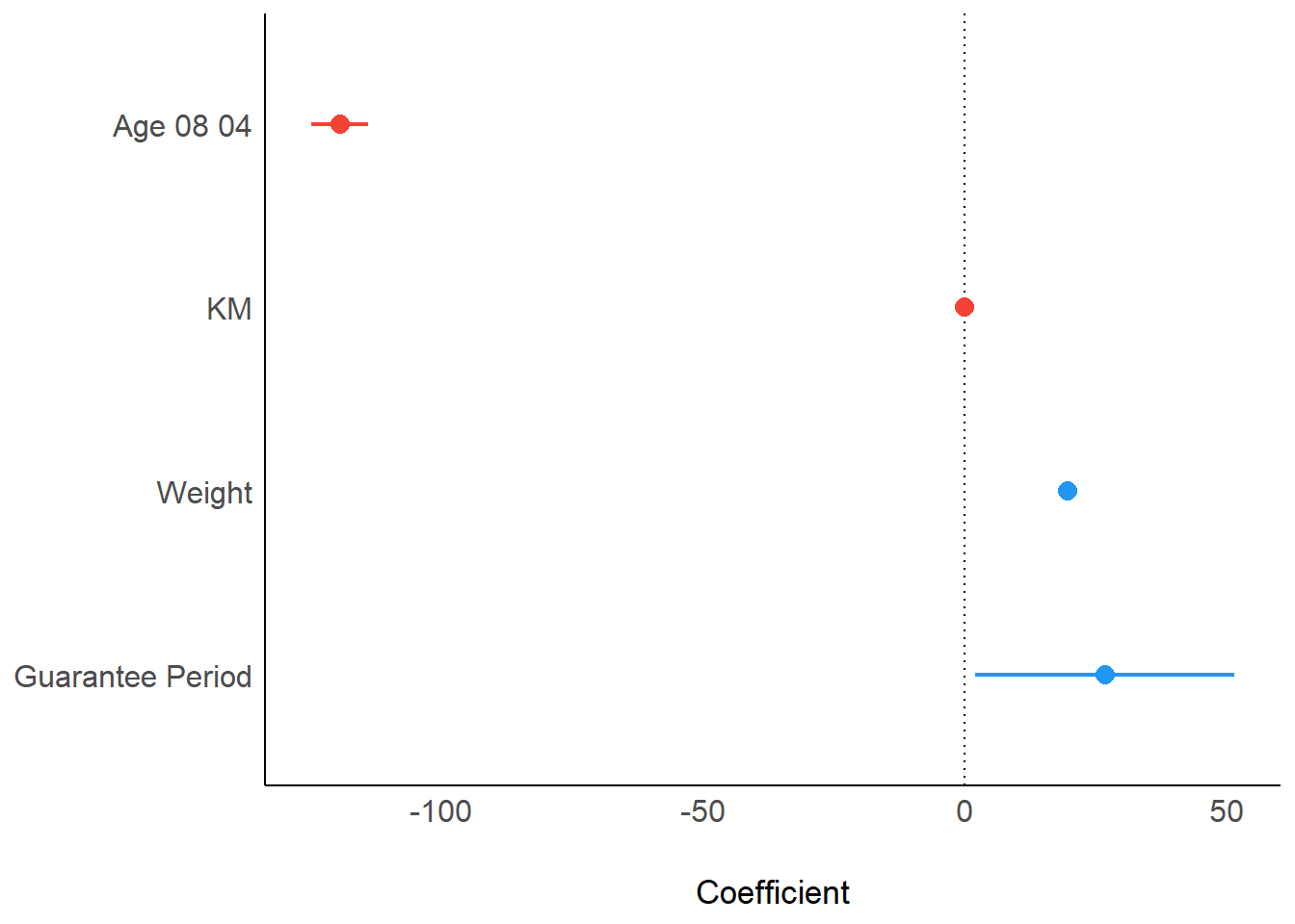
ggcoefstats(model1,
            output = "plot")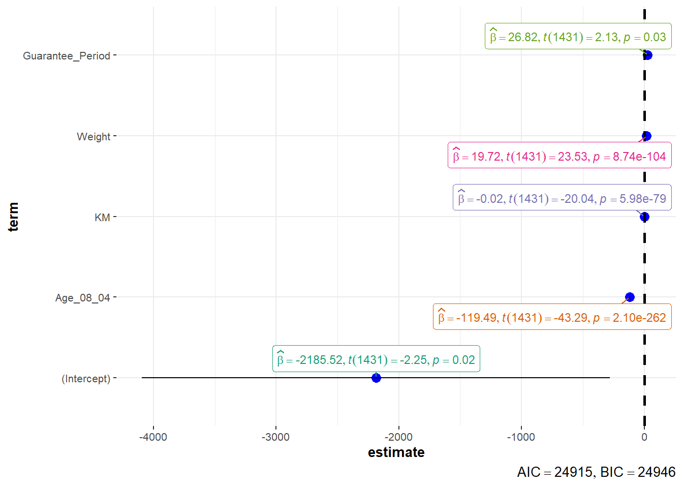
Visualizing Uncertainty
For this section, we will once again use the Exam Data.
The summary statistics of the data can be obtained using the code below.
my_sum <- exam %>%
  group_by(RACE) %>%
  summarise(
    n=n(),
    mean=mean(MATHS),
    sd=sd(MATHS)
    ) %>%
  mutate(se=sd/sqrt(n-1))
knitr::kable(head(my_sum), format = 'html')| RACE | n | mean | sd | se |
|---|---|---|---|---|
| Chinese | 193 | 76.50777 | 15.69040 | 1.132357 |
| Indian | 12 | 60.66667 | 23.35237 | 7.041005 |
| Malay | 108 | 57.44444 | 21.13478 | 2.043177 |
| Others | 9 | 69.66667 | 10.72381 | 3.791438 |
The data can then be plotted using the code chunk below.
ggplot(my_sum) +
  geom_errorbar(
    aes(x=reorder(RACE, -mean),
        ymin=mean-1.96*se,
        ymax=mean+1.96*se),
    width=0.2,
    colour="black",
    alpha=0.9,
    size=0.5) +
  geom_point(aes
           (x=RACE,
            y=mean),
           stat="identity",
           color="red",
           size = 1.5,
           alpha=1) +
  labs(x = "Maths score",
       title = "95% confidence interval of mean maths score by race")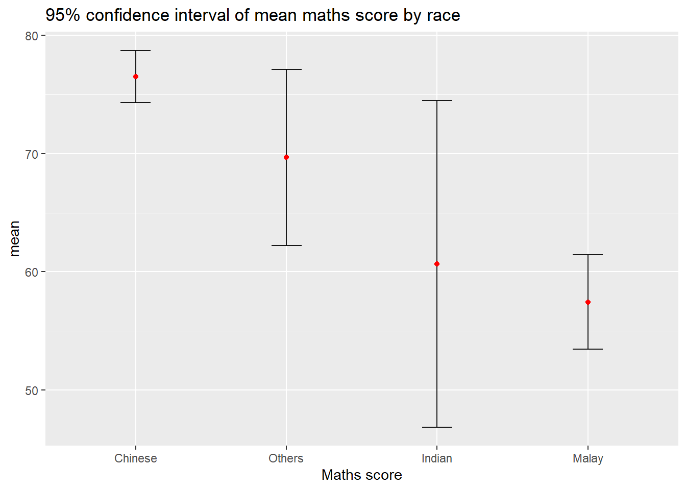
An interactive version of this plot can be created.
shared_df = SharedData$new(my_sum)

bscols(widths = c(4,8),
       ggplotly((ggplot(shared_df) +
                   geom_errorbar(aes(
                     x=reorder(RACE, -mean),
                     ymin=mean-2.58*se,
                     ymax=mean+2.58*se),
                     width=0.2,
                     colour="black",
                     alpha=0.9,
                     size=0.5) +
                   geom_point(aes(
                     x=RACE,
                     y=mean,
                     text = paste("Race:", `RACE`,
                                  "<br>N:", `n`,
                                  "<br>Avg. Scores:", round(mean, digits = 2),
                                  "<br>95% CI:[",
                                  round((mean-2.58*se), digits = 2), ",",
                                  round((mean+2.58*se), digits = 2),"]")),
                     stat="identity",
                     color="red",
                     size = 1.5,
                     alpha=1) +
                   xlab("Race") +
                   ylab("Average Scores") +
                   theme_minimal() +
                   theme(axis.text.x = element_text(
                     angle = 45, vjust = 0.5, hjust=1)) +
                   ggtitle("99% Confidence interval of average /<br>maths scores by race")),
                tooltip = "text"),
       DT::datatable(shared_df,
                     rownames = FALSE,
                     class="compact",
                     width="100%",
                     options = list(pageLength = 10,
                                    scrollX=T),
                     colnames = c("No. of pupils",
                                  "Avg Scores",
                                  "Std Dev",
                                  "Std Error")) %>%
         formatRound(columns=c('mean', 'sd', 'se'),
                     digits=2))
This data can also be visualized using ggdist using the following code.
exam %>%
  ggplot(aes(x = RACE,
             y = MATHS)) +
  stat_gradientinterval(
    fill = "skyblue",
    show.legend = TRUE
  ) +
  labs(
    title = "Visualising confidence intervals of mean math score",
    subtitle = "Gradient + interval plot")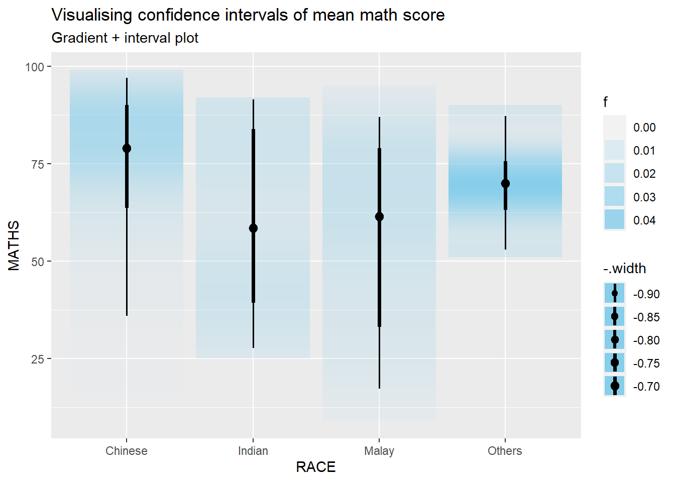
Hypothetical Outcome Plots can also be used.
ggplot(data = exam,
       (aes(x = factor(RACE),
            y = MATHS))) +
  geom_point(position = position_jitter(
    height = 0.3,
    width = 0.05),
    size = 0.4,
    color = "#0072B2",
    alpha = 1/2) +
  geom_hpline(data = sampler(25,
                             group = RACE),
              height = 0.6,
              color = "#D55E00") +
  theme_bw() +
  transition_states(.draw, 1, 3)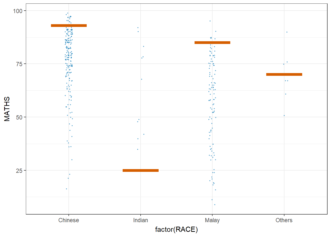
Funnel Plot
In this section, COVID-19_DKI_Jakarta will be used. The data was downloaded from Open Data Covid-19 Provinsi DKI Jakarta portal. The goal of this exercise is to compare the cumulative COVID-19 cases and death by sub-district (i.e. kelurahan) as at 31st July 2021, DKI Jakarta.
The code below imports the data into R.
covid19 <- read_csv("data/COVID-19_DKI_Jakarta.csv") %>%
  mutate_if(is.character, as.factor)
There are multiple ways to create a funnel plot using the tools at hand. Below are a few of the options available.
funnel_plot(
  numerator = covid19$Death,
  denominator = covid19$Positive,
  group = covid19$`Sub-district`,
  data_type = "PR",
  xrange = c(0, 6500),
  yrange = c(0, 0.05),
  label = NA,
  title = "Cumulative COVID-19 Fatality Rate by Cumulative Total Number of COVID-19 Positive Cases", #<<
  x_label = "Cumulative COVID-19 Positive Cases", #<<
  y_label = "Cumulative Fatality Rate"  #<<
)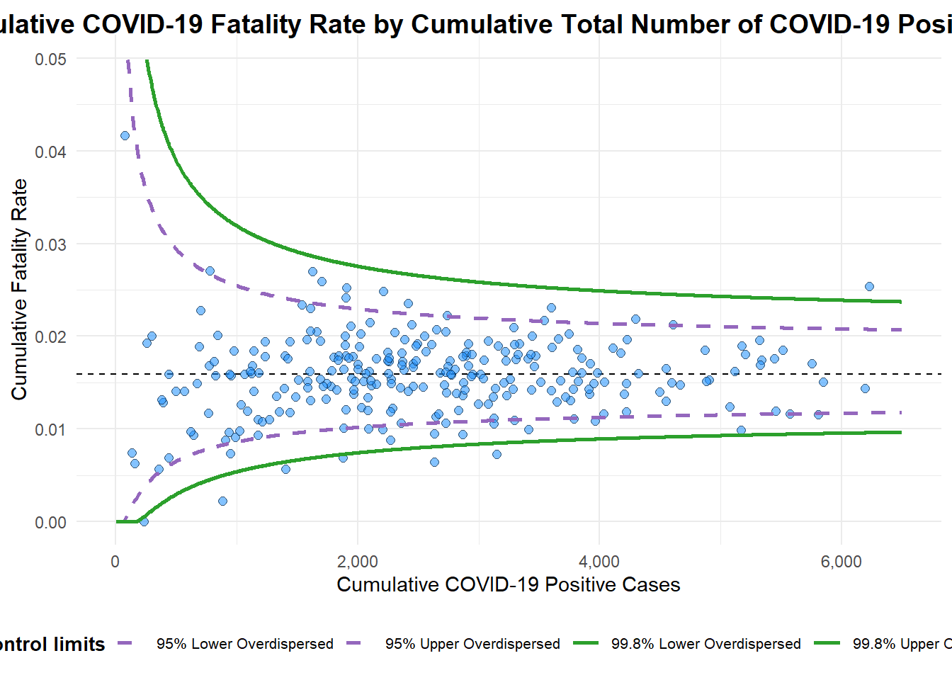
A funnel plot object with 267 points of which 7 are outliers.
Plot is adjusted for overdispersion.
df <- covid19 %>%
mutate(rate = Death / Positive) %>%
mutate(rate.se = sqrt((rate*(1-rate)) / (Positive))) %>%
filter(rate > 0)
fit.mean <- weighted.mean(df$rate, 1/df$rate.se^2)
number.seq <- seq(1, max(df$Positive), 1)
number.ll95 <- fit.mean - 1.96 * sqrt((fit.mean*(1-fit.mean)) / (number.seq))
number.ul95 <- fit.mean + 1.96 * sqrt((fit.mean*(1-fit.mean)) / (number.seq))
number.ll999 <- fit.mean - 3.29 * sqrt((fit.mean*(1-fit.mean)) / (number.seq))
number.ul999 <- fit.mean + 3.29 * sqrt((fit.mean*(1-fit.mean)) / (number.seq))
dfCI <- data.frame(number.ll95, number.ul95, number.ll999,
number.ul999, number.seq, fit.mean)
p <- ggplot(df, aes(x = Positive, y = rate)) +
geom_point(aes(label=`Sub-district`),
alpha=0.4) +
geom_line(data = dfCI,
aes(x = number.seq,
y = number.ll95),
size = 0.4,
colour = "grey40",
linetype = "dashed") +
geom_line(data = dfCI,
aes(x = number.seq,
y = number.ul95),
size = 0.4,
colour = "grey40",
linetype = "dashed") +
geom_line(data = dfCI,
aes(x = number.seq,
y = number.ll999),
size = 0.4,
colour = "grey40") +
geom_line(data = dfCI,
aes(x = number.seq,
y = number.ul999),
size = 0.4,
colour = "grey40") +
geom_hline(data = dfCI,
aes(yintercept = fit.mean),
size = 0.4,
colour = "grey40") +
coord_cartesian(ylim=c(0,0.05)) +
annotate("text", x = 1, y = -0.13, label = "95%", size = 3, colour = "grey40") +
annotate("text", x = 4.5, y = -0.18, label = "99%", size = 3, colour = "grey40") +
ggtitle("Cumulative Fatality Rate by Cumulative Number of COVID-19 Cases") +
xlab("Cumulative Number of COVID-19 Cases") +
ylab("Cumulative Fatality Rate") +
theme_light() +
theme(plot.title = element_text(size=12),
legend.position = c(0.91,0.85),
legend.title = element_text(size=7),
legend.text = element_text(size=7),
legend.background = element_rect(colour = "grey60", linetype = "dotted"),
legend.key.height = unit(0.3, "cm"))
fp_ggplotly <- ggplotly(p,
tooltip = c("label",
"x",
"y"))
fp_ggplotly